New Dining Room Chairs

Hi, I'm Lisa and I'm an addict!!!  I see things that other people see as junk and I have to rescue it! I want to bring it back to their former glory or give them an all new look updated look. Sometimes these projects are simple and easy. But sometimes I think, "Maybe I should have thought about this one more."


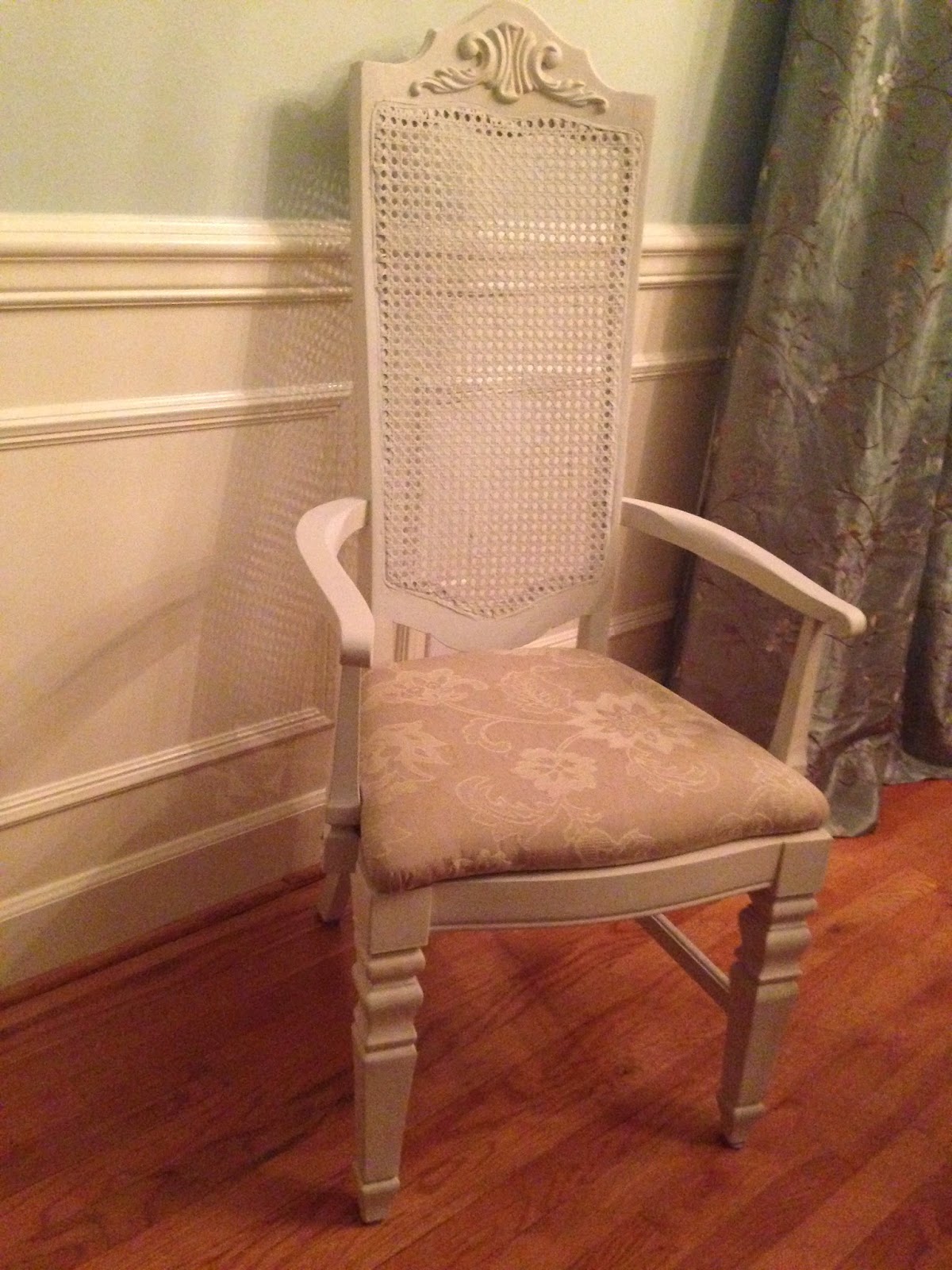
I found this set in pretty rough condition. Four of the chairs were either missing the caning in the back or it was damaged. I found the other four in near perfect condition. The previous owner had already painted them but they were 2 different colors so I had to repaint them.

 
Since I already had a dining room table that I love, I sold the table that went with the chairs. I was left with 6 side chairs and 2 armchairs. What drew me to these chairs was of course, that French look. 


I painted the chairs with Amy Howard's Linen paint. Then I used the antique wax to finish them off.  I love the molding on these chairs. 
 

Removing the lovely plastic from them was a huge improvement and the fabric wasn't bad but several were soiled so I decided to replace the kakhi floral damask. 


I chose a kakhi linen for the seats. It wasn't a huge change but if you are going to update, might as well do it right and go all the way.  I love how they turned out.


Here's my dining room with my old dining room chairs. There was nothing wrong with them. They were a French ribbon back chair set. In my previous home, I used these chairs in my breakfast room. Since I was using them in my dining room, I really wanted something a little larger with a higher back and that made a little more of a statement. 


What I really like about my new chairs is that they contrast with the dark table.  At the same time, the repeat of off white with the chairs, molding and chandelier gives 3 like elements which is key to decorating. 
 
 
So.......what made me rethink this project?  Well, once I got into it, I found it was a TON of work figuring out how to cane the back of the chairs.  My hubby did it for me but it took a lot trial and error.  The hardest part was finding the right size spline that holds the caning in place.  If I had known how hard it was to figure out on our own, I would have gladly paid someone else to do the work.  This is a dying trade and the closest caner is 30 miles away so I had thought we'd try it ourselves. 

Well, it did take some trial and error but AGAIN my husband made my dreams come true!   

Until next time, remember that Great Design Takes Time!


Lisa


Christmas Table: Create With What You Have!

Christmas is almost here!  Can you believe it?  Christmas is truly my most favorite time of the year.  In our home, we have Christmas music or a movie in the background at all times.  Yes, we are Christmas crazy!  Generally, it's mainly my daughter and me who are that way, but this year Brett has joined in our madness!  I'll share more on a little Christmas light decorating Brett has done. 

In preparing décor for any holiday or special occasion, I'm a firm believer that your first resource is what you already have.  I find my best designs come from this.  Now, I will say that I have stockpiled a number of really cool Christmas décor this year that I've been dying to use.  I bought some sparkling iced eucalyptus that I was excited to pull out this year.  I wasn't sure if I would use it on my tree on in an arrangement.  In the end, I used it in an arrangement on my dining room table. 

 
I had picked up these 2 rusty urns earlier in the year as well so I pulled them out.  I thought they'd make a great statement together on my farmhouse table. 

 
 I decided that I would use all décor that had that frosty winter look so I pulled out some pinecones and sprayed snow on them.  Then I had some red berries that I threw in for just a slight punch of color.  To give it that "snowy-look" I tore open an old pillow and stole the polyester filling out of it!  If I can repurpose, I will and it stretches my dollar for those items that really help make my table.  I also ran out to my birch tree in the front yard and grabbed a few twiggy limbs off it to give my arrangment a little more height.  

 
Next, I had bought some miniature mercury glass ornaments at the end of the year last year that I wasn't sure what I would use them for.  I found the perfect use for them to scatter across my burlap runner.  

 
I also had these 2 Christmas Santa's.  I had never found the right place for them at Christmas, but this year, I decided to put them back to back in the middle of my urns.  The one item I did buy was a white brush tree.  I began looking at my Santa's as setting the scene of them being in a magical winter wonderland.  

 
I really think that my Santa's pulled the whole look together!  Okay, so........what is that powdery stuff all over my runner?  Snow, you say?  How could it be?  Well, let me tell you about a little product that I found!  You will love it as much as my guest have!!!!!   
 
 
It is called, "Snow to Go."  You follow the directions on the package by adding water to it.  Then you can sprinkle it on your surface.  Be careful where you use it because it is wet so it could damage finer surfaces.  So where can it be found?  Let me tell you about one of the best kept secrets and I hope you will visit them!
  
 
You can find Snow to Go at The Cuckoo's Nest, at the corner of Old Highway 280 and Highway 55 in Westover, Alabama.  This was the former home of my grandparents, Luther and Wilma Hatcher.  I love going there because I love all the fun things in the store but it also is one of the ways I let my grandparents' memory live on.  This year, the snow at my table will be my reminder of them and my daddy.
 
 
The end result is beautiful!  I'm loving my table and I wish that every decorating project  I did brought me as much joy.  What I want you to gain from this project is to take a look around at what you already have.  Take a look in your attic, think about what maybe a relative has that they aren't using, go to the Thrift store, look outside and find a few unique things that you may already have or have seen out shopping.  Start pulling the look together and let it evolve!  You'll be amazed at what you can come up with yourself! 
 
I hope each and every one of you have a blessed holiday season!  I hope to share a few more Christmas project with you.  As always, remember.......
 
Great Design Takes Time!
 
Lisa


Antiquing Furniture: A Tale of a Little Girl's Bedroom

Have I told you how much I love antiquing furniture?  Well, I really, really, really do!  I continue to be in awe of the transformation that can occur. 
 
I had the pleasure of working with a mother and daughter on a bedroom suite recently.  The family had just purchased a new home and had begun the decorating process.  The bedroom suite was furniture that was from several rooms in their old home.  It included her parent's wedding bed which was a dark teak wood, a pair of pickled oak bookcases from an office and then 2 French Provencial chests that were in the little girl's room from the old house.  In the end, we united them and made them work by antiquing them with Amy Howard Paint. 
 
As you see the bed was beautiful but when I saw it I KNEW that it was going to be even more beautiful.  By antiquing them in white the true beauty of the carvings showed! 
 
 
In the end, the lingerie chests boasts the French ornamentation.   
 
 
I used Dust of Ages to bring out the carvings and gave it a look as if it was a sculpted artwork.
 
 
It looked like a true antique piece in the end. 
 
 
Even the these chest of drawers got a little dusting too! 
 
 
The pickled oak bookcases looked like custom built-ins in the end. 
 
 
I had a lot of fun transforming this mix matched furniture into a beautiful set for a special princess!  Antiquing furniture is a great way to do just that. 
 
Until next time, don't forget that Great Design Takes Time!
 
 
Lisa
 

Eclectic Design: When the Eye Sees Art

What is Eclectic Design?  Eclectic Design is a medley of various styles over various periods of time.  It forms when items are chosen simply because the eye likes them and sees them as art. 

That is definitely true with one of my most recent clients.  They enjoy going to art shows, auctions, consignment stores, and hole in the wall stores.   From these ventures emerge true diamonds they find in the rough. 

When we first met, it was obvious they knew what they loved by the pieces they already had.  They simply just needed help pulling their look together so that their discoveries worked in harmony and not against each other.  The artwork was what stood out to me the most and became the focal point of the project.  I started out by selecting paint that complimented and set the artwork off. 

Their artwork goes from line drawings of architectural buildings........


to lithographs of villages........


to watercolors of a small town harvest.....


to a watercolor of a barn.....

 
 to live pictures of outer space......


and to an antique print updated with a modern painting of a robot stomping through an ancient city.
 

Oh!  And how could I forget the Alabama Football artwork that boasts a number of Daniel Moore's signed prints?


The paint selection became the backdrop for the artwork.  My client wanted colors that were dark and rich.  Chocolates, grays, navy and fresh green were chosen as backdrops for their collection.  By just painting a house they had purchased, it became a home that showcased their love for art.   After the paintwork was completed, the pictures were grouped and hung so that they would compliment each other as well as furniture and accessories in the room.  It was amazing the transformation that took place!

Until next time, remember that Great Design Takes Time!

Lisa 


How to Choose a Coffee Table

Like many of you, I remember the days when a coffee table's only purpose was a resting place for drinks, books and television remotes.  They were more about function than design and rather boring. 

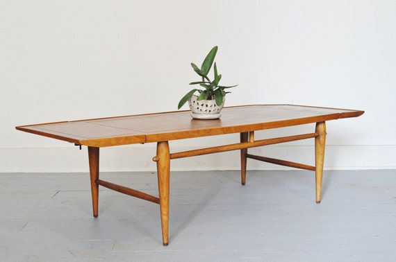
Mid-Century Drop Leaf Lane Coffee Table
Source:  https://www.etsy.com/listing/153098932/mid-century-drop-leaf-lane-coffee-table?ref=related-4

There was a period of time that they got big........Trend Spotted: Round Coffee Tables! More living room decorating ideas: http://www.bhg.com/rooms/living-room/family/living-room-decorating-ideas/?socsrc=bhgpin071713roundcoffeetable=13
Source:  http://www.bhg.com/rooms/living-room/family/living-room-decorating-ideas/?socsrc=bhgpin071713roundcoffeetable&page=13&crlt.pid=camp.05v5yewkgToB

and bigger.............................................
huge coffee tables // black velvet chairs
Source:  Pinterest.com


and even BIGGER!!!
a huge coffee table is a fantastic idea. can't tell if this is all one piece, or several that could be moved apart. loving the orange glass pendants too
Source:  http://www.pinterest.com/pin/35677022017931979/


Then there was a period of time we decided they took up too much space and many homes did without them.

Now they are a fashion statement to any room.  We don't just place a coffee table in front of the sofa anymore.  Instead, we use them to anchor our conversational area together.  What should you consider in choosing the right coffee table for your space?

First, let's discuss shape.  There are various shapes of coffee tables now.  For conversation areas that are wide, a rectangular coffee table may be the best fit.  Smaller spaces find circular or square tables to work better. 

Second, you should think about size.  You want to make sure that there is at least 2 feet of walking space around your coffee table.  This helps give you a beginning guideline as to the size of table you need.  Some conversation areas may be rather large and have seating for 10 or more people, while others are small and only seat 3 people. 

Last, we will look at style.  That is what it is all about now!  You will find coffee tables that are fancy, rustic, modern, industrial and from various world influences.  The style is what makes them unique.https://blogger.googleusercontent.com/img/b/R29vZ2xl/AVvXsEgda9f9VQhWHNN8e3Xn8-42WQazm4gZkFNN_3atiwdgx3rgIBiZVoo9Waruw2xwaz4d39Lfm0s0e9agysinBJqrsFOy0xNGjsklneDoE330Dkwi9WHzY4qNMa7ERFqNUSCMhZ6Ek3rhxejh/s1600/beach_industrial-baskets-coffee-table-metal-fireplace-0712-dempster12-xl.jpg
When choosing my coffee table, I took all of these factors in consideration.  I first decided on the shape I needed.  For my space, I decided that I wanted a round or square coffee table.  Then I measured my space and that I needed no more than a 30" table.  Lastly, I took a great deal of time deciding what style I wanted and what complimented the existing furniture.  I had seen this one from Restoration Hardware and fallen in love it. 
Wallpaper (“Mayanne”/White #5139): Phillip Jeffries, Coffee tables (“Distressed Ionic Capital Coffee Table”): Restoration Hardware,  Area rug (Calvin Klein Loom Select): Calvin Klein Rugs, calvinkleinrugs.com.  Art over mantel:  arteriorshome.com.  Sconces; chandelier: Circa Lighting,  Tables flanking mantel (“Sutton Criss-Cross Side Table”); head sculpture (The Split); marble urns: Noir,noirfurniturela.com.
Source:  http://www.pinterest.com/pin/235735361718954247/

Just so you know, this one cost around $2K, which is a bit much.  Then, I began seeing another one almost identical to it on the Internet.  I was hesitant to buy it because I hadn't actually seen it.  One day, I went into one of my favorite stores, Greystone Antiques and saw it.  It was priced less than 1/2 of the Restoration Hardware one and it was every bit as beautiful.  I finally decided that it was the look and style I wanted for my living room. 


I love the architectural look of the ionic column.  The hand carving is beautiful.  It has chippie paint and a pine stained top.  It's both elegant yet rustic which is the style I want in my home.  Can you tell the difference in it and the Restoration Hardware one? 
 
 
In case you are interested in purchasing the ionic capital coffee table, I encourage you to visit Greystone Antiques showroom in Birmingham, Alabama.  The last time I checked, they still had one.  Let them know that I sent you. 

Until next time, remember:  Great Design Takes Time! 


Lisa


Antiquing Cabinets

Cabinetry  can be one of a home's greatest architectural features.  Often homeowners are dissatisfied with the cabinets in their home.  They are either not the right color, outdated or a wood finish that isn't appealing to them.  To replace cabinets is extremely expensive, not to mention the mess it makes.  Believe it or not, to have them painted can be almost as expensive!

One of the reasons, I began using Amy Howard at Home Paint is that you can use it to paint cabinetry with no stripping or sanding!  That takes half the work and mess out of the project. 

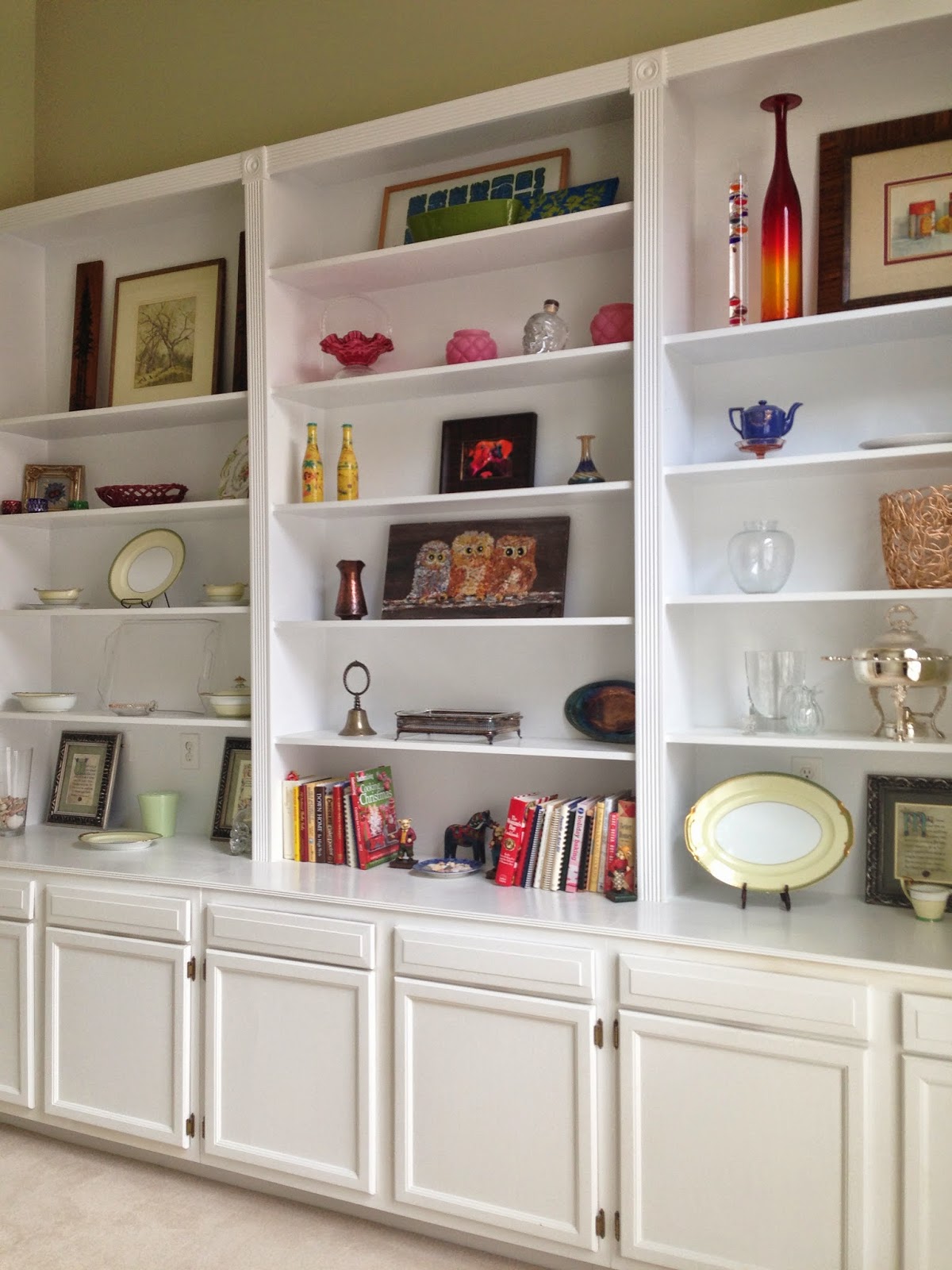
Recently, one of my clients was talking to me about a custom butler's pantry cabinet they had in their dining room.  It was painted white.
 

The cabinets were needing refreshing and the client really wanted to do something other than just giving them a fresh coat of white.


We talked about antiquing the cabinets to accent them more.  First, I painted them with Amy Howard's Linen paint. 


Then I used Amy Howard's antique wax and dark wax to give them an antiqued look. 
 

The most beautiful part of the piece was the molding but it was hardly noticed when it was painted white.  Now it stands out because it has depth!


Nothing is more rewarding to me than to stand back and see the difference a change like this can make to a room.  The butler's pantry really makes a statement in this room!


I hope you enjoyed seeing how antiquing cabinets can change a room.  I can't wait to show you later how they look accessorized.

Remember, Great Design Takes Time!


Lisa